Design System
UI Kit
Revolve - A Halfords Design System
What?
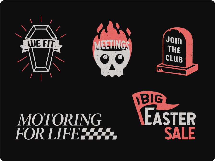
I led the work on a comprehensive collection of guidelines, components and resources for Halfords.com. With such a well recognised brand the main challenge was to strike a balance between using the existing brand elements and introducing a refreshed web-first identity. Oh and we had T-Shirts made.
Why?
By creating and maintaining the design system our teams can streamline their workflows, improve collaboration, and maintain brand identity and visual coherence across different platforms and applications. It promotes reusability, scalability, and maintenance of design assets, making it easier to create and iterate on products while reducing inconsistencies and duplication of effort.
How?
Collaboration, Iteration, a Single Chunky Figma file, Maintenance, Maintenance and Maintenance.
Process
Team
Design Crits
What?
A Crit (short for critique) is when designers and guests come together to share and give feedback on designs that are still being worked on. It's a way for them to discuss and improve their work in progress. Oh and we show our artistic side by hastily drawing things on a touchpad.
Why?
By implementing a Crit process, we can foster a culture of ongoing and transparent feedback. It not only helps teams enhance their feedback skills but also minimizes isolated working environments and helps people celebrate their work.
How?
We host a meeting every week where three designers share their designs in a FigJam file. During this interactive session, we comment on them and (use stickers, gifs) to provide feedback and critique the designs. It's a safe space and an engaging way for designers to collaborate and improve their work together.
UX
High FIdelity
Journey Design
What?
It’s never been easier to buy a set of tyres. But still, it can be a stressful process. Halfords can help users with that. As the online retailer with the single most fulfilment options for tyres it can get complicated for the user. This is where my team came in.
Why?
Some users don’t care about what tyres they purchase as long as the process fast and convenient. Some users will only settle for the best. Some prefer driving to the garage to save a bit of money, some have a flat tyre and need a Mobile Expert. We have a solution for every scenario but how we connect the right journey with the right user problem?
How?
We’ve created full flows like the Tyre Shopping Journey from the ground up multiple times. In this example the main difference to our competitors is that the user will be able to select the type of service they need before selecting the product that will be fitted to their car. This service-first approach was then applied to all of our high price-tag service items.
UI
Accessibility
High Fidelity
UI Basics
What?
You can never go too deep when it comes to UI. Toggle or Radio Button? What’s the best practice for a Vehicle Registration Number field? Micro-interactions, CTAs, Chips, Tabs and all that Jazz.
UX
Research
Comp Analisys
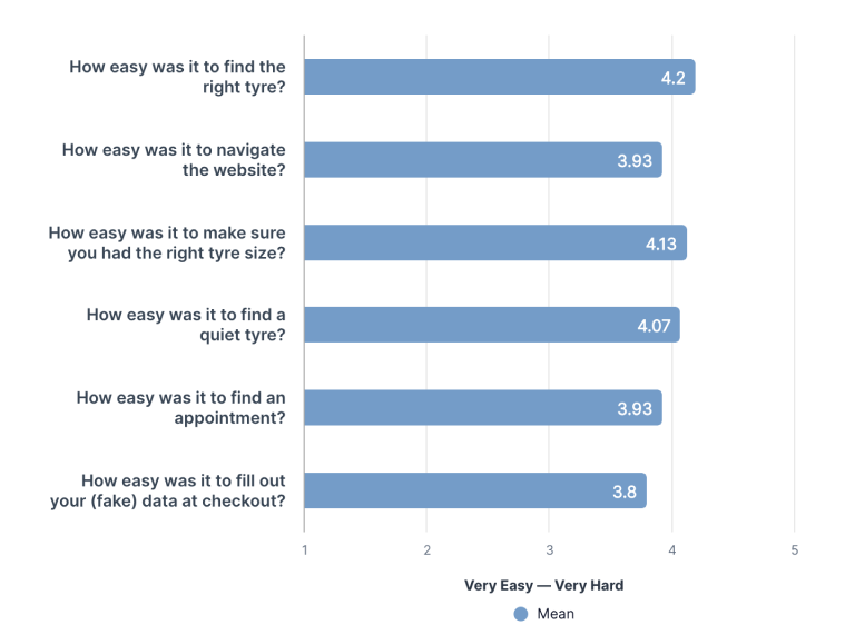
User Testing
What?
We rarely ask our product testers any questions. However we often set them goals and watch their journey very-very closely.
Why?
Sometimes jus to prove a point, but most times to check and recheck our thought process. When I’m 2 months in designing a brand new user journey it’s very hard to see the screens like I’m seeing it for the first time. We check for flow, copy, usability and general feedback. We check new concepts, the current site and competitors too.
how?
We use UserZoom’s screen and voice record feature. After a precise screening we ask real users to complete a task on the website or a prototype, then we watch the recorded video with their commentary.
UX
Research
Comp Analisys
After Hours
What?
Branding, animation, typography poster design and whatever comes to mind. After a long day of designing it sure is nice to design some more!